Apple’s Aural Skeuomorphism Lingers
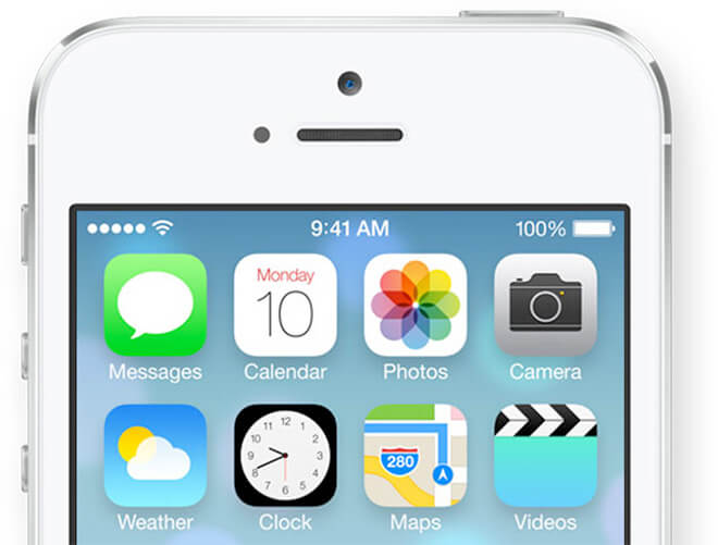
I have finally installed iOS 7 (beta 5—haven’t had time to follow up with the latest builds) and I am extremely enthusiastic about the whole thing: Same but very different, very gracious gestures and clever shortcuts, slimmer typography, play on transparencies, parallax, etc.
Well, I was actually really excited until I tried to change a sound alert associated with a specific event. Surprisingly, Jonathan Ive’s flat design does not extend to the aural space and one is still presented with the usual quack, ding, boing, et al. I can’t understand why this aspect of the user experience has been alluded so far. How (literally) dissonant these silly sounds feel compared to the rest of the OS! Some might argue that there are more elaborate sounds one can use (orchestra hits, ukulele, etc.) but still: how does this sonically reflect the change of paradigm of iOS 7? Isn’t it simply an aural form of the skeuomorphism that Apple is supposedly moving away from?

Isn’t there some really clever person in Cupertino translating these bitter-sweet gradients into sounds? In a post titled The History of the “Boo-Dah-Ling” Sound, Kelly Jacklin narrates how he created the completion sound (158-marimba, 158 standing for do-sol-do) but I cannot find anything about the current state of iOS 7’s sound world (even though some people offer sound libraries for iOS).
I personally feel that a timbral approach would be interesting: just like the blue, yellow, and red blend together in the new design, couldn’t we imagine accidents between strings and winds, percussion and sine waves, or microtonal gestures to alert us of a sent tweet, or an upcoming meeting?
The future of mobile UI is not for our eyes and fingers only: our ears can get us there too.